Understand your AI usage: every agent, model, and request
Cailee Moberg · · Updated
Every company that spent the last two years deploying agents is now asking the same question: what are they costing us, and which ones are worth it? OpenRouter’s Activity dashboard and Analytics API answer that question per agent, per model, per request.
Open Activity to see how spend breaks down across agents, apps, and team members. Find out which models and tasks drive costs, and where caching cuts your bill. Create and save custom views, then drill from any chart down to the individual requests.
All of the data is available through the Analytics API. Point your agent at the openrouter-analytics skill to dig into your usage, get a quick answer in your terminal, or pull the numbers into your own dashboards.
Start with the big picture
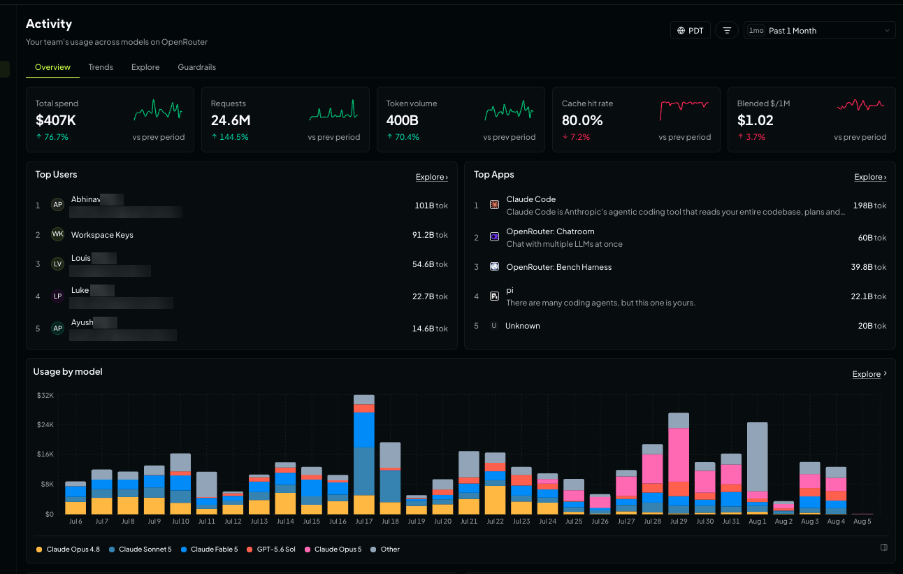
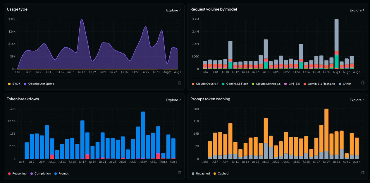
Overview is your usage at a glance. Five metrics at the top: total spend, requests, token volume, cache hit rate, and blended cost per million tokens, each with a sparkline and a comparison against the previous period. On the same screen, your top users and apps, spend by model, OpenRouter credits versus BYOK spend, request volume by model, prompt and completion token breakdown, and prompt caching.
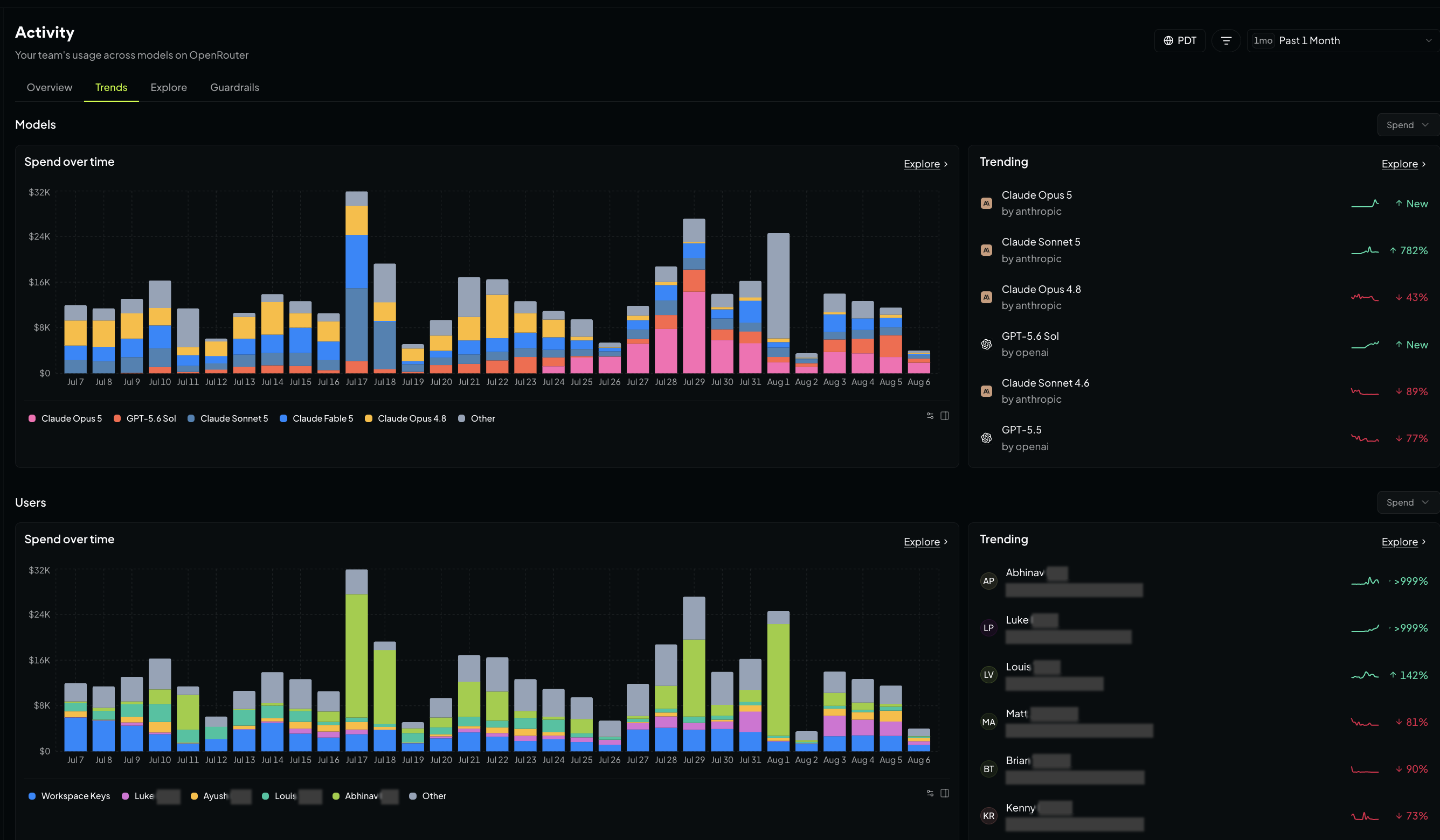
Trends takes the same data and sorts by movement instead of size, with a panel showing what’s rising and falling. See your trends across models, users, API keys, and apps. Use it to spot a runaway agent, a new model gaining traction, or a tool spreading across your org.
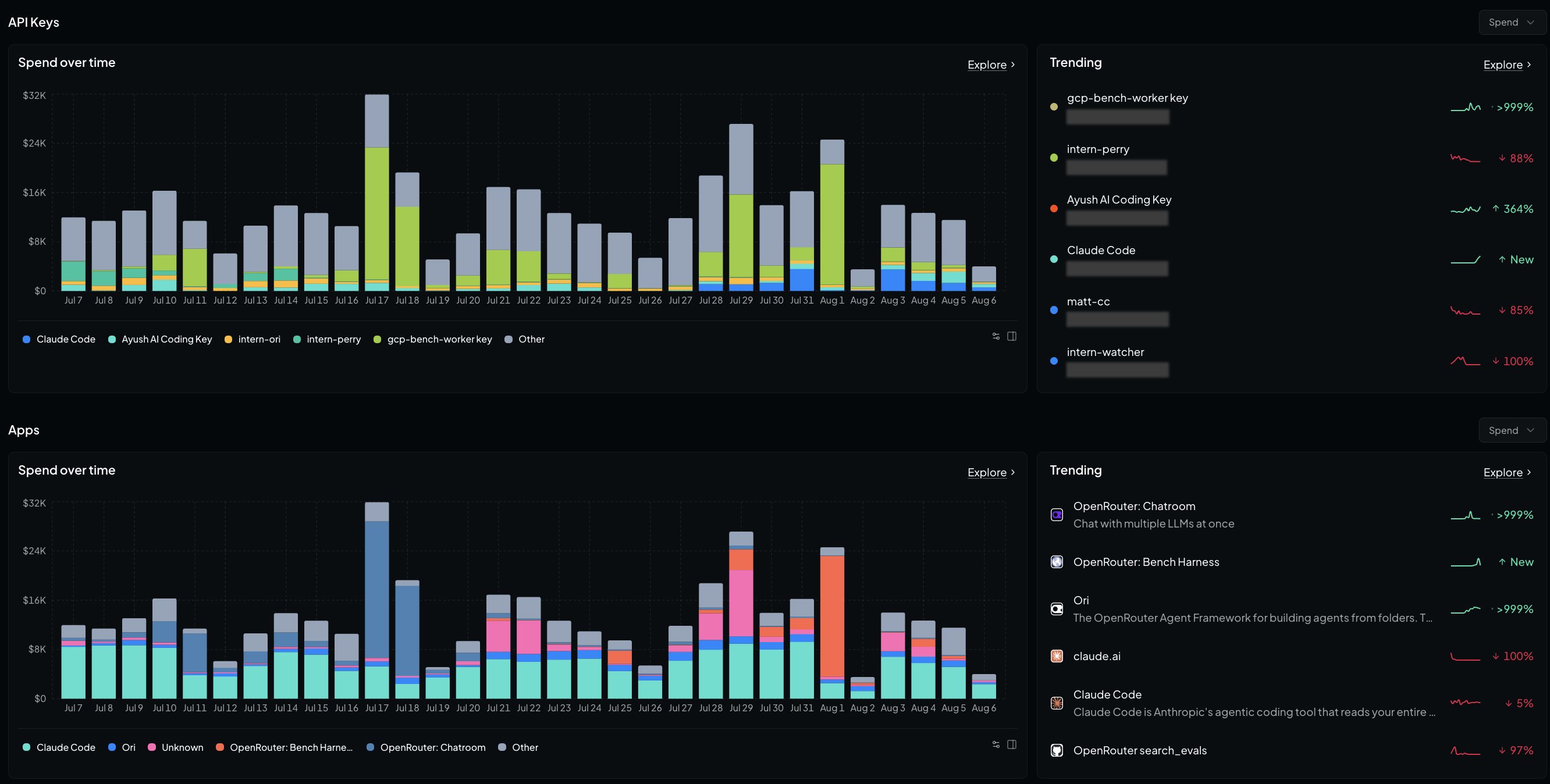
Explore any question
Every card on Overview and Trends links into Explore, where you assemble the view yourself:
- Metric: spend, request count, tokens (prompt, completion, reasoning, or cached), cache hit rate, blended cost per million tokens, BYOK versus credit spend, or latency and throughput down to P50/P90/P99
- Group by (up to two dimensions): model, variant, provider, API key, app, user, workspace, origin, country, data region, finish reason, context length, session, generation, custom user IDs, or any classifier dimension you’ve defined
- Rollup: minute, hour, day, week, or month, or drop the time axis for a ranked table
- Chart type: bar, line, or dot plot
Use it to see which apps are driving usage in each workspace, which models your agents are using for each task type, or how your provider latency is trending over time.
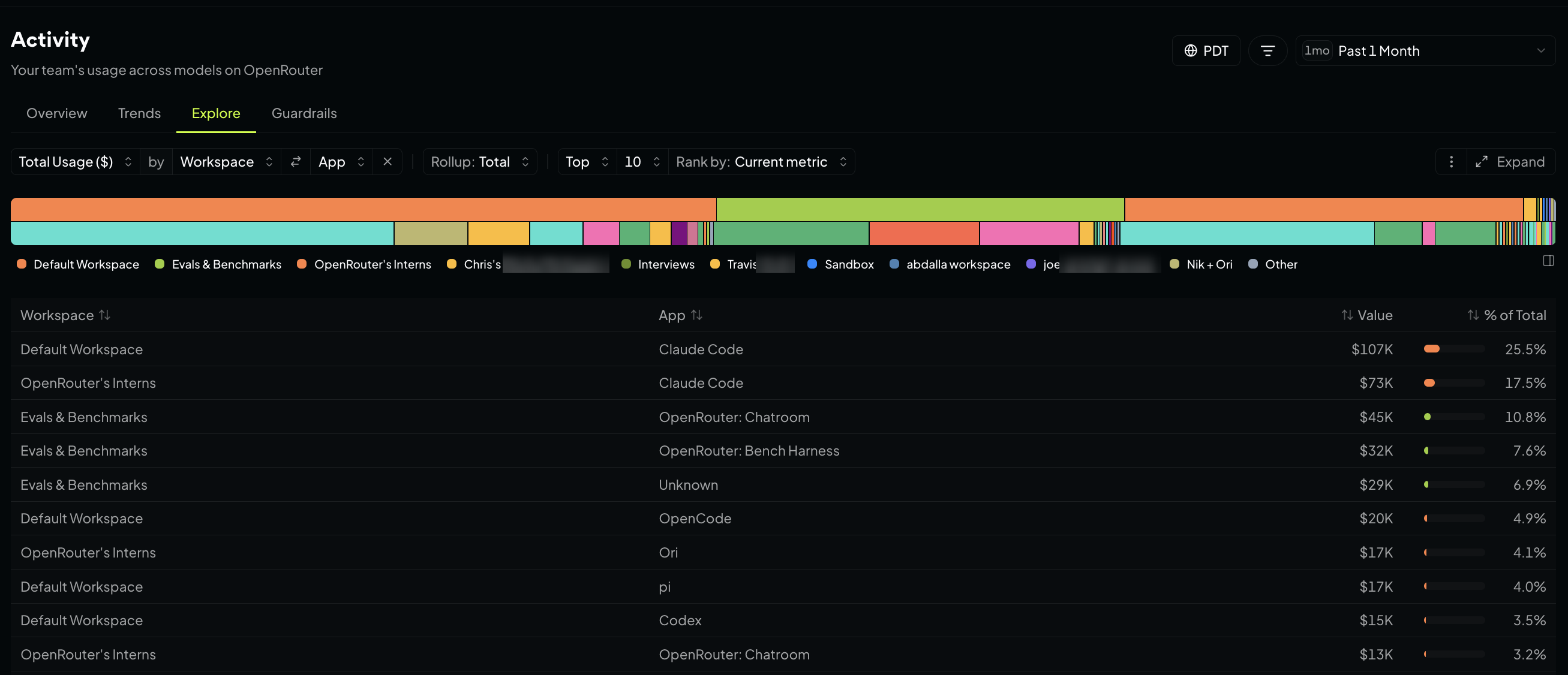
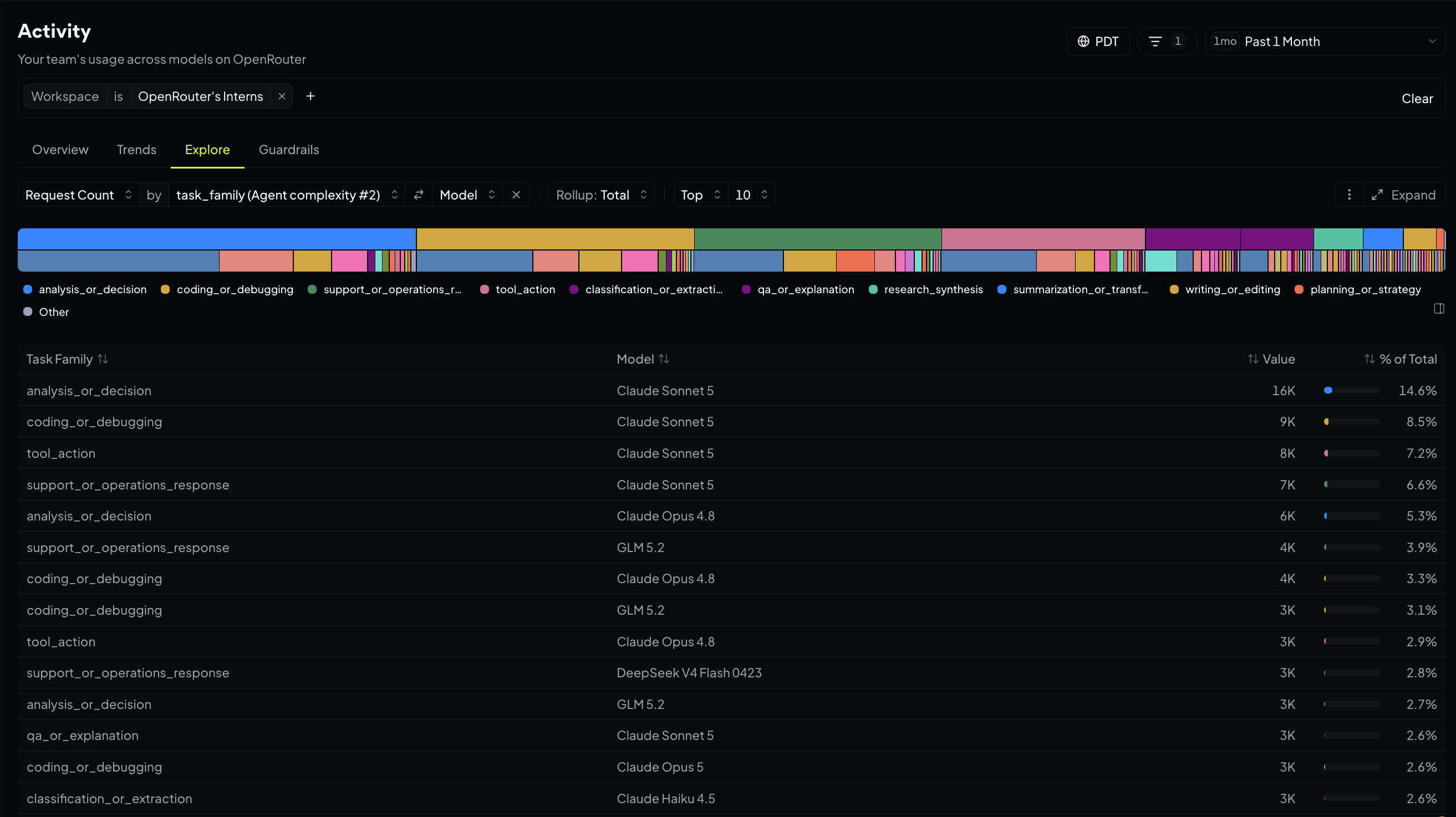
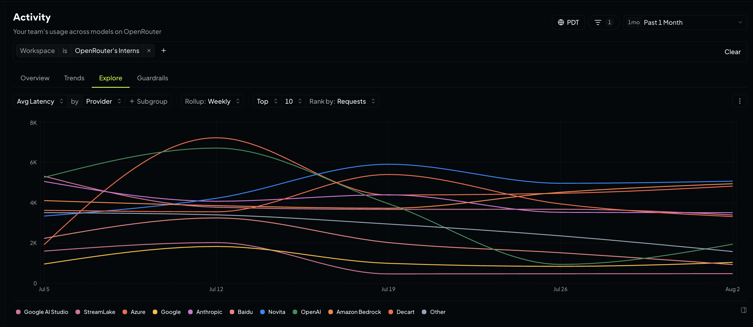
Save your go-to views. Open the options menu, choose Save current chart, and name it. In an organization you also choose who sees it: Only me, or Everyone in my organization.
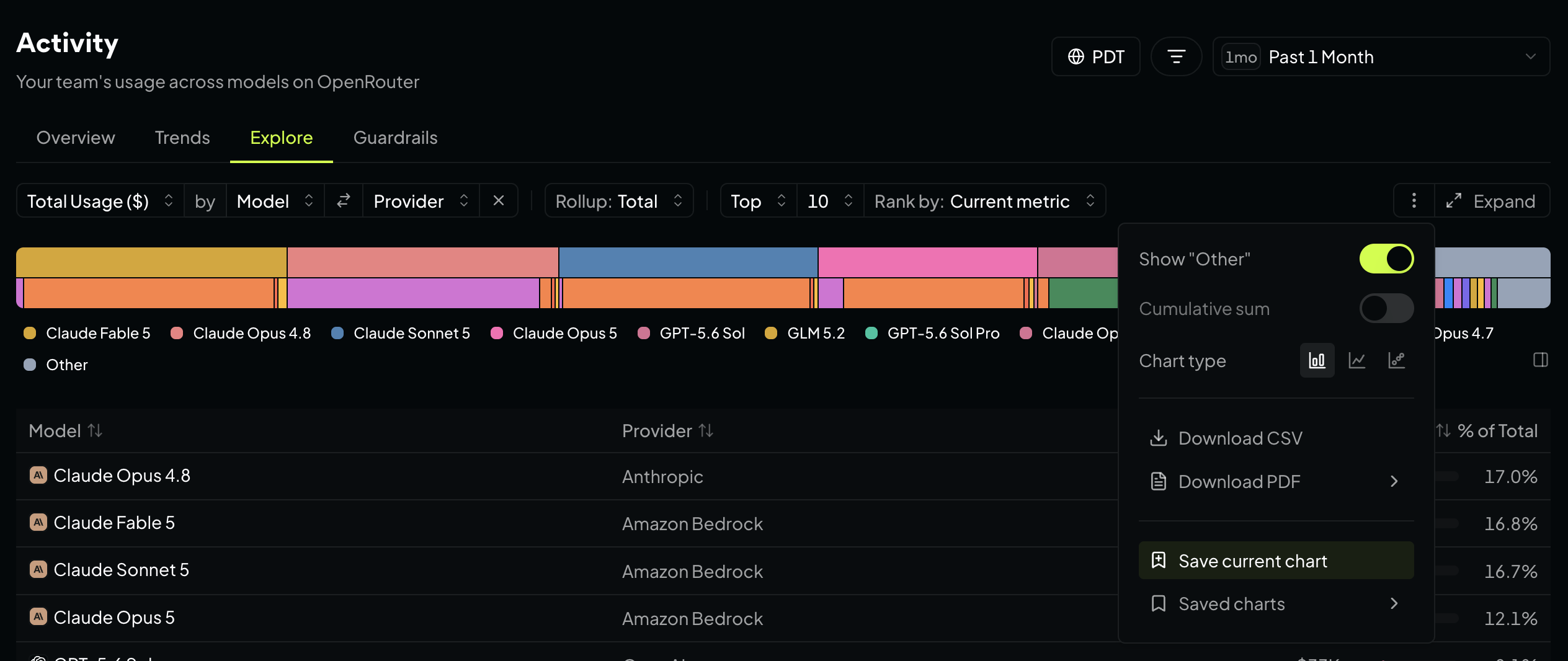
Download CSV or Download PDF to send any chart’s data straight into a spreadsheet or report.
Guardrails shows what your prompt injection and sensitive-information rules blocked, redacted, or flagged, and which rules are doing the work. Use it to monitor the rate of sensitive data entering your prompts, and which rules and data types are catching it. Filter by workspace or classifier to narrow in on where it’s coming from.
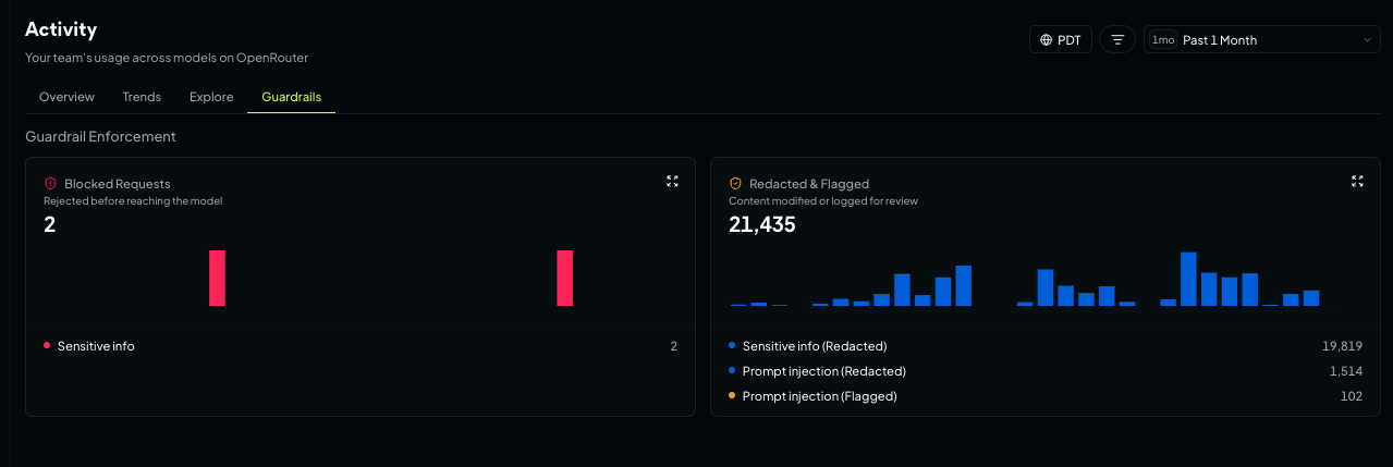
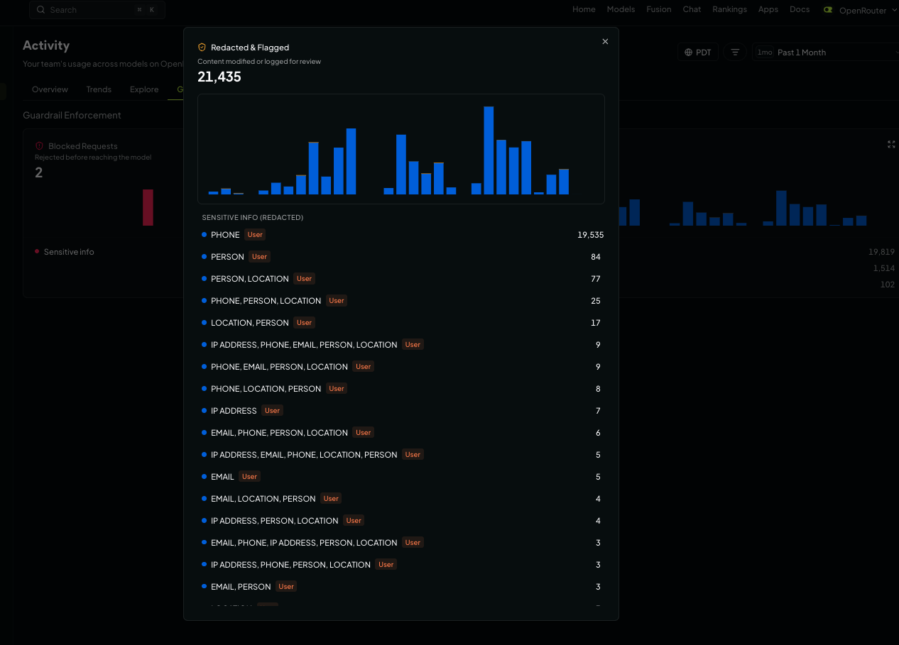
Expand a card to get the full breakdown, including which combinations of detected patterns drove each block, redaction, and flag.
Click a chart, land in the logs
Aggregates show you that something got expensive. The next question is which requests.
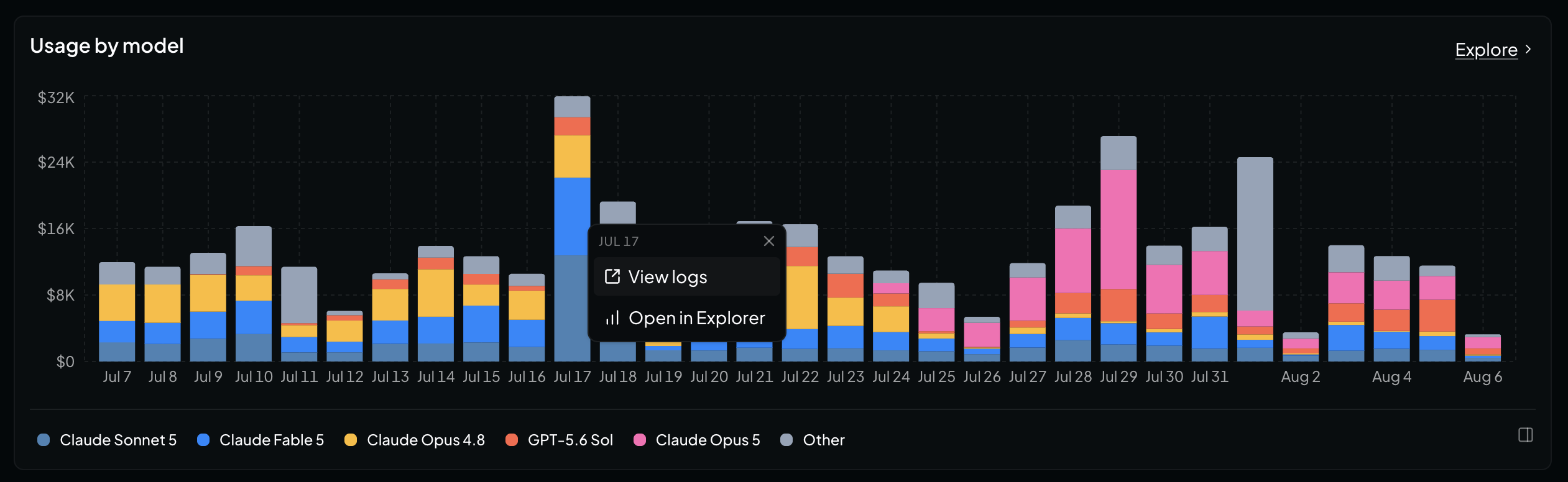
Every chart and ranked table in Activity links through to the logs behind it. Click Tuesday’s bar, one model’s slice of a stacked chart, or a row in a ranked table, and you land in your logs filtered to those requests.
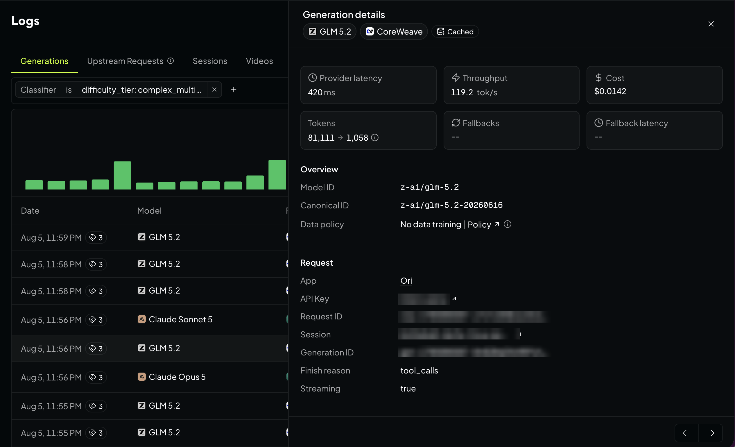
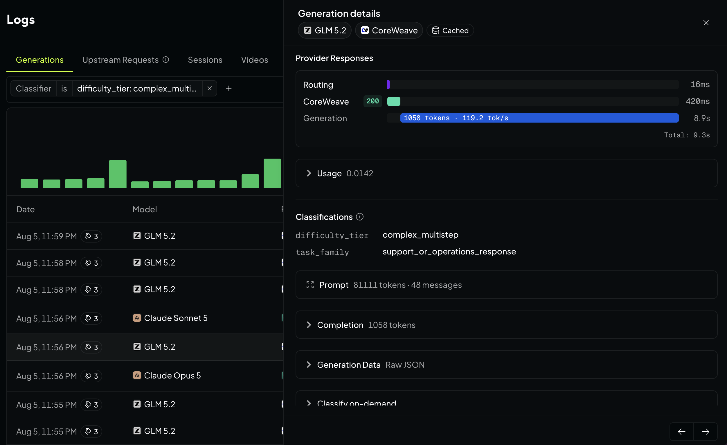
Open any row in logs for the Generation detail view. It shows:
- Cost: upstream inference, caching, web search, and file processing, plus the discounts and cache savings applied
- Performance: provider latency, throughput, and time to first token
- Routing: which provider served the request, whether it fell back to another one, and the finish reason
- Attribution: the app, API key, and workspace behind it, plus session and request IDs and data region
- Context: any guardrail events, classifier tags, and the raw metadata
The Prompt detail view renders the full messages array and a flamegraph of estimated tokens per message colored by role: system, user, assistant, and tool. A conversation that costs three times what you expected usually shows it here as a wide band of tool calls or a heavy system prompt. The cached prefix is shaded, so you can see how far into the prompt the cache held and which message broke it.
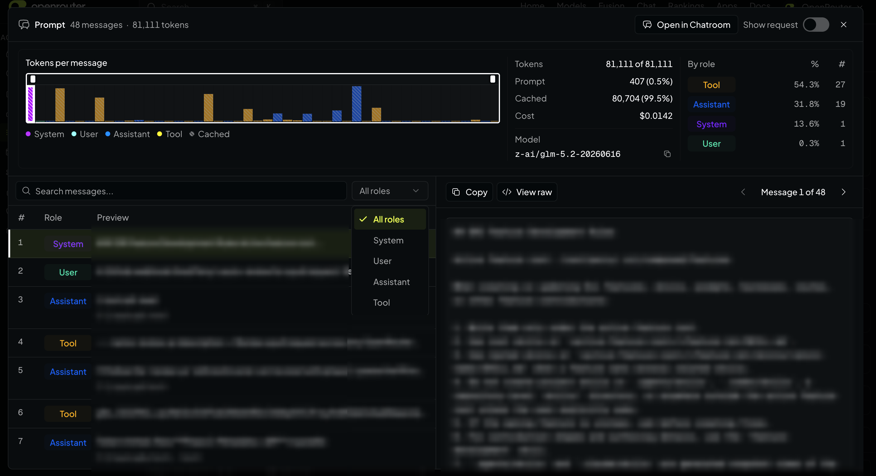
Per-message token counts are estimates derived from message size; the totals on the generation itself are recorded usage. Prompts and completions detail only exist if private input/output logging was enabled when the request ran, which you can enable in your workspace observability.
Same data as Explore, via API
Everything in Explore is also available through the Analytics API: let your agent run the analysis, get a quick answer in your terminal, or pull the numbers into your own dashboards. Analytics queries require a management key. Two endpoints:
GET /api/v1/analytics/metareturns the currently supported metrics, dimensions, filter operators, and granularities. Call the metadata endpoint first to see what’s available; we’re always adding new metrics and dimensions.POST /api/v1/analytics/queryruns the query and returns the same aggregates the Explore charts are drawn from.
curl -X POST https://openrouter.ai/api/v1/analytics/query \
  -H "Authorization: Bearer $OPENROUTER_API_KEY" \
  -H "Content-Type: application/json" \
  -d '{
    "metrics": ["total_usage", "tokens_total", "cache_hit_rate"],
    "dimensions": ["model"],
    "granularity": "day",
    "time_range": {"start": "2026-07-01T00:00:00Z", "end": "2026-08-01T00:00:00Z"},
    "limit": 20
  }'
For agents
The cost control cookbook puts your agent in charge of spend analysis. Give your coding agent a management key and the openrouter-analytics skill and have it run a cost review on your OpenRouter account. It finds the models costing a multiple of your blended rate per million tokens, traces them back to the keys and pipelines responsible, and returns ranked recommendations.
We ran this internally and found a preview model burning ~$6.2K/month at roughly 25x the org’s blended rate. One drill-down query later, 98% of it traced to a single batch-pipeline key running a task that never needed a frontier model. The fix was a one-line model swap. See the query recipes and agent prompts we used in the cookbook.
Get started
Open Activity, or start in Explore if you already know the question you want answered. To work from your terminal instead, grab a management key and hit the Analytics API.
Tell us what you’d like to see next in #feedback on Discord.
Frequently asked questions
What can I see on the Activity dashboard?
Total spend, request volume, token volume, cache hit rate, and blended cost per million tokens, broken down by model, provider, API key, app, user, workspace, country, and more. Organization views rank your top users and apps; personal accounts rank your top API keys and apps.
How do I save a chart in Activity Explore?
Build the chart you want, open the options menu in the Explore controls, and choose Save current chart. Name it, and in an organization choose whether it's visible to only you or everyone in your organization. Saved charts keep the metric, dimensions, filters, chart type, rollup, ranking, and date range, and you can load, rename, or delete them from the Saved charts menu.
Can I see the individual requests behind a chart?
Yes. Every chart and ranked table in Activity is clickable. Clicking a bar, a stacked segment, or a ranked row opens your logs filtered to those requests, carrying over both the grouping and the time bucket you clicked.
Why can't I see the prompt for some generations?
Prompt and completion content is only stored when input and output logging was enabled at the time the request was made. Turn it on under Workspace, then Observability. Enabling it later doesn't recover content for past requests, and organization members may not have permission to read another workspace's prompts.
Can I query my usage data with the API?
Yes. The Analytics API exposes the same metrics and dimensions as Activity Explore through two endpoints: one that lists the currently supported metrics, dimensions, filter operators, and granularities, and one that runs a query. It requires a management key; regular inference keys get a 403.
How far back does the data go?
Up to about 365 days for most queries. Some metrics, filters, and dimensions read from raw generation records instead of pre-aggregated data, including latency, throughput, generation ID, data region, and classifier filters. Those are capped at roughly 31 days, as is any query rolled up by hour, and minute rollups are limited to a 3-hour window. Activity tells you when it has clamped your range.