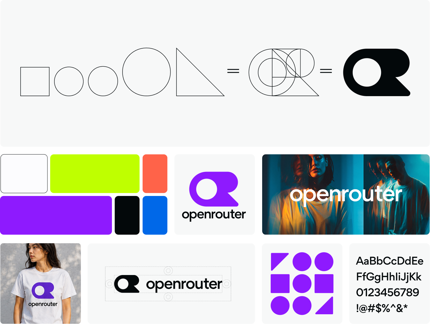
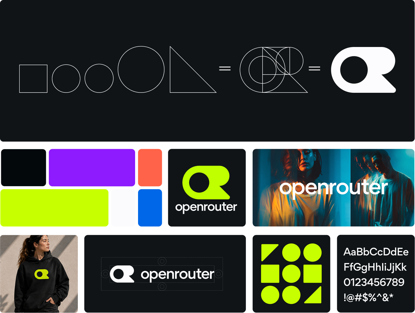
A New Look for OpenRouter
Julian Thayn ·
Today marks a new milestone for OpenRouter.
What began as a platform connecting the world’s leading AI models has become the foundational infrastructure for the intelligence era. We’ve expanded our offerings, welcomed new partners, announced our Series B, and continued building for a world where intelligence is more connected, more capable, and more widely available than ever before.
As OpenRouter evolved, it became clear our brand identity needed to evolve with it. The brand that represented us in our earliest days no longer reflected the company we are today or the ambitions we have for tomorrow.
So we set out to create something new. A visual identity built from the same first principles that shape our platform.
We began with the logo.
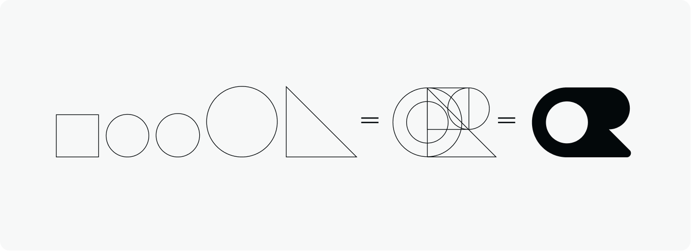
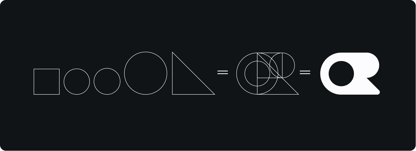
We started with sketches, then refined the idea through structure. Mathematics became our guide. Balance informed every decision.
Using a series of geometric shapes arranged within a precise framework, a distinct OR emerged: a mark built on logic and designed to endure.
That process gave us the centerpiece of our new identity: a logo rooted in Bauhaus philosophy, where form follows function and every element serves a purpose.
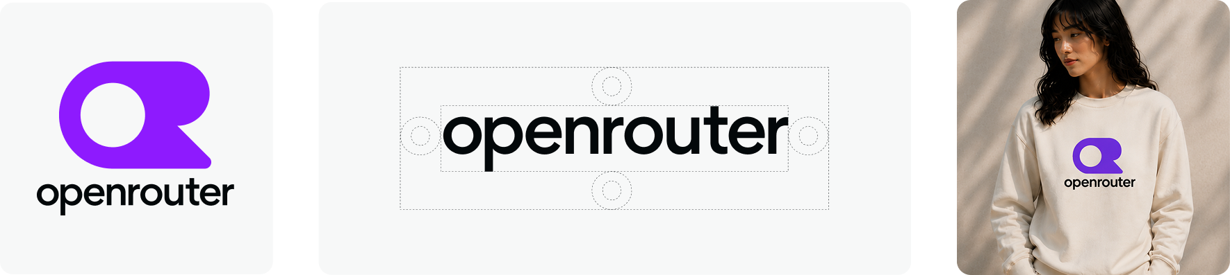
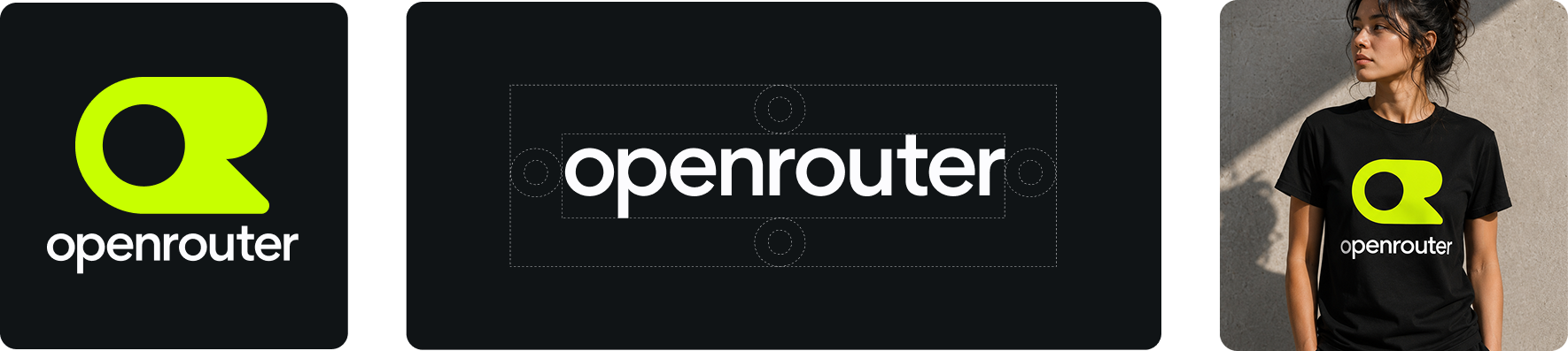
The world’s best AI models become more valuable when they work together. We applied that same idea across our entire identity.
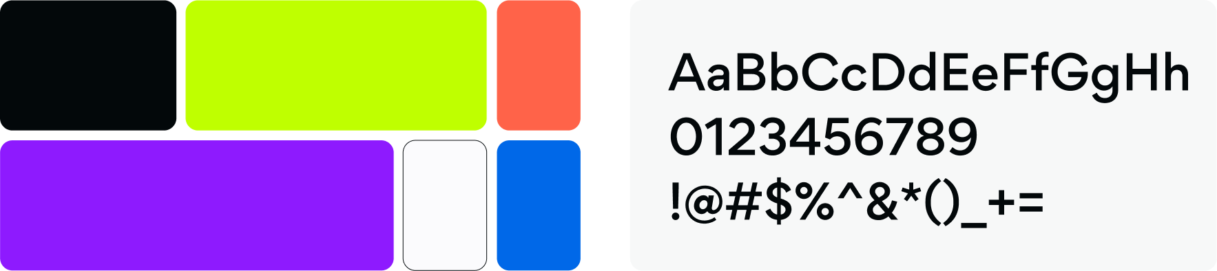
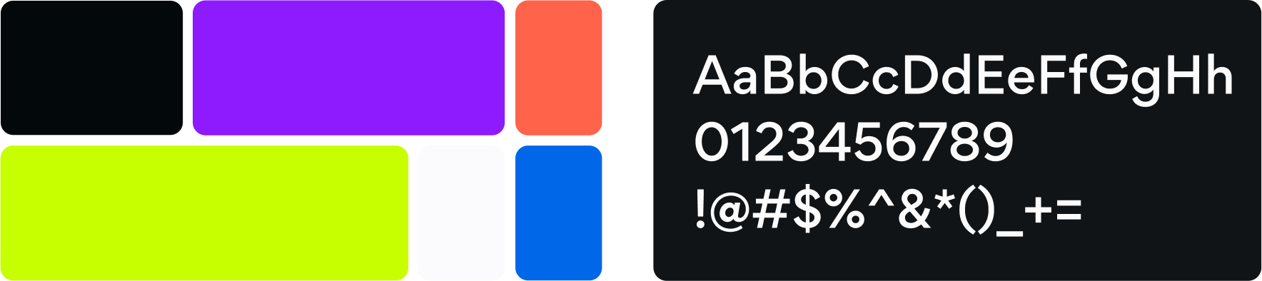
Our new typeface echoes the geometric discipline of the logo while remaining approachable, balanced, and versatile.
Our expanded color palette was designed with equal intention. Bright colors create moments of energy and optimism. Deeper tones bring confidence, focus, and balance.
Even light mode and dark mode were approached as distinct environments, intentionally integrated across web, mobile, and every product experience.
Together, these decisions mark the beginning of OpenRouter’s next chapter.
An expression of the principles that define us.
A declaration of the opportunities we intend to create.
For developers.
For enterprises.
For everyone turning intelligence into impact.